项目中遇到的一些常用样式
uniapp-textarea
- 问题描述
在对 textarea 设置边框/padding时,整个宽度就会溢出手机屏幕
- 解决
<view class="textarea_box">
   <view class="update_text">简介</view>
   <textarea :value="shopInfo.stationIntro" @input="listenTextStation"
       placeholder-class="placeholder" placeholder="请输入简介" maxlength="120"/>
</view>.textarea_box {
width: 100%;
margin-top: 5px;
height: auto;
textarea {
border: 1px solid #CCCCCC;
padding: 20rpx;
border-radius: 12px;
margin-top: 5px;
width: 100%;
box-sizing: border-box;
}
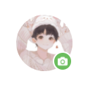
}头像编辑时,嵌入的相机图标
效果图
代码
<view class="avator_box">
    <view class="avator" @click="handleUpadateAvator">
        <!-- 图片源 -->
        <image :src="params.image | imgOnlineToken" class="avator_image"></image>
        <!-- 右下角 相机图标 -->
        <image src="@/static/user/icon_photo_camera.png" class="update_icon"></image>
    </view>
</view>.avator_box {
/* 让头像居中 */
display: flex;
justify-content: center;
.avator {
position: relative;
width: 80px;
height: 80px;
.avator_image {
width: 100%;
height: 100%;
border-radius: 50%;
position: relative;
}
/* 让图标与头像盒子形成相对路径,这样right0时,不会跑偏 */
.update_icon {
width: 14px;
height: 14px;
background: #6cbd5f;
border-radius: 50%;
padding: 5px;
position: absolute;
bottom: 0;
right: 0;
border: 2px solid #fff;
}
}
}uniapp 输入框样式修改
place-holoder颜色修改- 输入框高度
<view class="form_item">
    <label class="">昵称</label>
    <input class="" placeholder-class="placeholder" placeholder="请输入昵称" v-model="params.name" />
</view>.form_item {
display: flex;
align-items: center;
height: 50px;
line-height: 50px;
label {
width: 60px;
font-size: 28rpx;
}
input {
line-height: 50px;
height: 50px;
/* 关键 */
min-height: 50px;
border-bottom: 1px solid #F4F4F4;
flex: 1;
padding: 0 15px;
}
}
/* 输入框 placeholder样式 */
/deep/ .placeholder {
color: #CCCCCC;
font-size: 28rpx;
display: flex;
align-items: center;
line-height: 50px;
height: 50px;
min-height: 50px;
}element-ui placeholder样式修改
.el-input__inner::placeholder {
    color: #fff;
    text-align:center;
}
    /* 谷歌 */
.el-input__inner::-webkit-input-placeholder {
    color: #fff;
    text-align:center;
}
    /* 火狐 */
.el-input__inner:-moz-placeholder {
    color: #fff;
    text-align:center;
}
    /*ie*/
.el-input__inner:-ms-input-placeholder {
    color: #fff;
    text-align:center;
}
css文字超出元素省略,单行、多行省略
单行省略
.singe-line {
    text-overflow: ellipsis;
    overflow: hidden;
    /* 这个不是必须的 */
    word-break: break-all;
    white-space: nowrap;
}
两行省略
.double-line {
    /* 这个不是必须的 */
    word-break: break-all;
    overflow: hidden;
    display: -webkit-box;
    -webkit-line-clamp: 2;
    -webkit-box-orient: vertical;
}
超过元素宽高省略
需要设置元素宽度与高度,根据高度看下最多能放几行,再设置-webkit-line-clamp的值为最大行数
.over-line {
    height: 65px;
    /* 这个不是必须的 */
    word-break: break-all;
    overflow: hidden;
    display: -webkit-box;
    -webkit-line-clamp: 3;
    -webkit-box-orient: vertical;
}- 📖 参考文档
让背景图片旋转180度
把背景图放到伪类中进行旋转
.large_title_right {
	position:relative;
	width: 670px;
	height: 72px;
	img {
		width: 148px;
		height: 54px;
		z-index: 333;
	}
}

/* 关键代码 */
.large_title_right::after {
	content:'';
	background-image: url(./../assets/img/header/top_01.png);
	background-repeat: no-repeat;
	background-size: 100% 100%;
	width: 670px;
	height: 72px;
	transform: scaleX(-1);
	position: absolute;
}图片翻转180度
transform: rotate(180deg);
-webkit-transform: rotate(180deg);
/* 还可以再加个旋转动画 */
transition: transform .5s;
数据大屏中,常见的边角
效果图
由于UI给了图标,所以,这里的边角就用图标显示,并且只需显示左右上角。此外,还可以直接用border去实现,具体请看参考文档
页面代码
<div style="width: 100%; height: 180px;" class="echarts_box">
    <!-- 边角 -->
    <span class="lt_icon"></span>
    <span class="rt_icon"></span>
    <!-- 柱状图 -->
    <div ref="agriculturalBar" style="width: 100%; height: 100%"></div>
</div>
css样式代码
.echarts_box {
    background-image: linear-gradient(0deg, rgba(20,26,38,0.80) 0%, rgba(32,45,70,0.29) 100%);
    box-shadow: inset 0px 0px 30px 0px rgba(45,93,117,0.2);
    position: relative;
    width: 100%;
    /* 关键代码 */
    .lt_icon {
        position: absolute;
        left: 0;
        top: 0;
        background-repeat: no-repeat;
        background-size: 100% 100%;
        background-image: url(../../assets/img/header/bevel_01.png);
        width: 10px;
        height: 10px;
    }
    /* 这里用了伪类,主要是要给图片做翻转 */
    .rt_icon::after {
        content:'';
        background-repeat: no-repeat;
        background-size: 100% 100%;
        background-image: url(../../assets/img/header/bevel_01.png);
        width: 10px;
        height: 10px;
        transform: scaleX(-1);
        position: absolute;
        right: 0;
        top: 0;
    }
}- 📖 参考文档
上层元素遮挡下层元素 点击事件
由于在项目过程中,遇到 z-index 级别过低,导致点击事件失效,真的很让人头痛
解决方法
对上层元素添加下列属性
pointer-events: none;但是,这样虽然最下层的元素可以点击了,新的问题又来了。上层元素包裹的子元素点击不了
这时候,需要对包裹的子元素添加下列属性
pointer-events: auto;- 📖 参考文档
背景图居中 - flex 居中
效果图如下:
图例分析
如上图所示,我们可以看出,以下几点:
最外层的 div 填充背景色
div 中,包裹着一个背景图
背景图上,滚动文本
页面代码
<!-- 最外层 div -->
<div class="introduct_box">
    <span class="lt_icon"></span>
    <span class="rt_icon"></span>
    <!-- 文本背景图 -->
    <img src="@/assets/img/bg_sl01.png"/>
    <!-- 滚动文本 -->
    <vue-seamless-scroll
        :data="listData"
        :class-option="classOption"
        class="warp"
    >
        <div style="height: 200px">
            {{ $store.state.travel.item.details }}
        </div>
    </vue-seamless-scroll>
</div>
css 样式代码
这里是通过 flex 布局,对文本背景图进行居中
.introduct_box {
    background-image: linear-gradient(0deg, rgba(20,26,38,0.80) 0%, rgba(32,45,70,0.29) 100%);
    box-shadow: inset 0px 0px 30px 0px rgba(45,93,117,0.2);
    font-family: PingFang SC-Bold, PingFang SC;
    height: 154px;
    width: 100%;
    display: flex;
    justify-content: center;
    align-items: center;
    padding: 10px;
    position: relative;
    img {
        width: 100%;
        height: 136px;
        position: relative;
    }
    .warp {
        width: 350px;
        height: 120px;
        overflow: hidden;
        font-size: 14px;
        font-weight: 400;
        line-height: 20px;
        position: absolute;
        top: 20px;
        bottom: 20px;
        letter-spacing: 1px;
    }
}
背景图居中 - 定位居中
<div class="content">
     <img src="img_p1_title.png">
</div>.content{
width:340px;
height:40px;
position: relative;
}
.content img{
position: absolute;
top: 50%;
left: 50%;
transform: translate(-50%, -50%);
}- 📖 参考文档
优惠券
左右两侧分布,分割线在中间
效果图
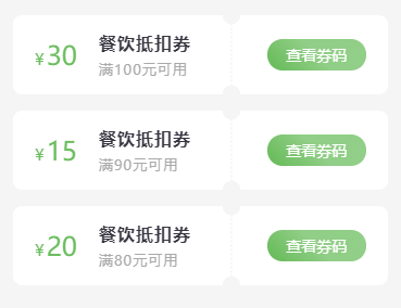
页面代码
<view class="coupon_card" v-for="(item,index) in couponList" :key="index">
    <view class="coupon_card_lt">
        <view class="price"><label>¥</label>{{item.price}}</view>
        <view class="coupon_info">
            <view class="coupon_name">{{item.title}}</view>
            <view class="coupon_desc">{{item.desc}}</view>
        </view>
    </view>
    <view class="coupon_card_rt">
        <view class="btn" @click="handleToDetail(item)">查看券码</view>
    </view>
</view>
样式代码
.coupon_card {
    display: flex;
    padding: 15px 20px;
    align-items: center;
    background: #fff;
    border-radius: 8px;
    margin-bottom: 15px;
    -webkit-mask-image: radial-gradient(circle at 201px 8px, transparent 8px, red 8.5px), radial-gradient(closest-side circle at 50%, red 99%, transparent 100%);
    -webkit-mask-size: 100%, 2px 4px;
    -webkit-mask-repeat: repeat, repeat-y;
    -webkit-mask-position: 0 -8px, 200px;
    -webkit-mask-composite: source-out;
    mask-composite: subtract;
    .coupon_card_lt {
        flex: 1;
        display: flex;
        align-items: center;
        .price {
            font-size: 24px;
            color: #6cbd5f;
            label {
                font-size: 15px;
                margin-right: 2px;
            }
        }
        .coupon_info {
            margin-left: 20px;
            color: rgba(33, 32, 44, 0.9);
            letter-spacing: 1px;
            .coupon_name {
                font-weight: bold;
            }
            .coupon_desc {
                font-size: 13px;
                margin-top: 5px;
                color: darkgrey;
            }
        }
    }
    .coupon_card_rt {
        width: 30%;
        .btn {
            background: linear-gradient(45deg, #6cbd5f 10%, #91ce87 50%);
            font-size: 14px;
            color: #fff;
            border-radius: 20px;
            text-align: center;
            padding: 5px 10px;
        }
    }
}
左右两侧分布,渐变色 + 背景图
因为这里背景图是透明底图,并且用了background,以至于渐变色只能放置最外层,并且会穿透背景图。 如果只想一边是有带渐变色的,建议背景图直接用 image 标签写,渐变色只写在一侧即可。
效果图
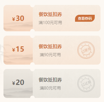
页面代码
<view class="coupon_card" :class="[item.status === '03' ? 'lated_bg' : '']"
    v-for="(item,index) in couponList" :key="index">
    <view class="lt">
        <view class="price" :class="[item.status === '03' ? 'lated_color' : '']"><label>¥</label>{{item.price}}</view>
    </view>
    <view class="line"></view>
    <view class="rt flex_al just_bw">
        <view class="coupon_info">
            <view class="coupon_name" :class="[item.status === '03' ? 'lated_color' : '']">{{item.title}}</view>
            <view class="coupon_desc">{{item.desc}}</view>
        </view>
        <view v-if="item.status == '01'" class="btn" @click="handleToDetail(item)">查看券码</view>
        <image class="icon" v-else-if="item.status == '02'" mode="widthFix" src="@/static/img/icon_coupon_used.png"></image>
        <image class="icon" v-else mode="widthFix" src="@/static/img/icon_coupon_lated.png"></image>
    </view>
</view>
样式代码
.coupon_card {
    display: flex;
    border-radius: 12px;
    margin-bottom: 15px;
    width: 100%;
    background: linear-gradient(180deg, rgba(255, 182, 140, 0.21) 0%, rgba(255, 94, 0, 0.21) 100%);
    .lt {
        position: relative;
        flex: 0 0 0 200rpx;
        padding: 60rpx;
        text-align: center;
        background: url('https://pic.imgdb.cn/item/65658f7cc458853aef274720.png');
        background-size: 100% 100%;
        background-repeat: no-repeat;
        .price {
            font-size: 24px;
            font-weight: bold;
            color: #CA6F3A;
            label {
                font-size: 16px;
                margin-right: 2px;
            }
        }
    }
    .line {
        position: relative;
        flex: 0 0 0;
    }
    .rt {
        position: relative;
        flex: 1;
        text-align: center;
        background: url('https://pic.imgdb.cn/item/65658f7dc458853aef27477b.png');
        background-size: 100% 100%;
        background-repeat: no-repeat;
        padding: 40rpx;
        .coupon_info {
            .coupon_name {
                color: #CA6F3A;
                font-weight: 700;
                margin-bottom: 9px;
            }
            .coupon_desc {
                font-size: 14px;
                opacity: 0.45;
            }
        }
        .btn {
            background: #CA6F3A;
            font-size: 12px;
            color: #fff;
            padding: 4px 10px;
            border-radius: 15px 0 15px 0;
        }
        .icon {
            width: 120rpx;
            height: 120rpx;
        }
    }
    .line:before, .line:after {
        content: '';
        position: absolute;
        width: 32rpx;
        height: 16rpx;
        background: #FDF8F2;
        left: -18rpx;
        z-index: 1;
        }
        .line:before{
        border-radius: 0 0 16rpx 16rpx;
        top: 0;
        }
        .line:after{
        border-radius: 16rpx 16rpx 0 0;
        bottom: 0;
        }
}

.lated_bg {
    background: linear-gradient(180deg, rgba(185, 185, 185, 0.21) 0%, rgba(70, 70, 70, 0.21) 100%) !important;
}
.lated_color {
    color: #0000008c !important;
}
左右两侧分布,渐变色
效果图
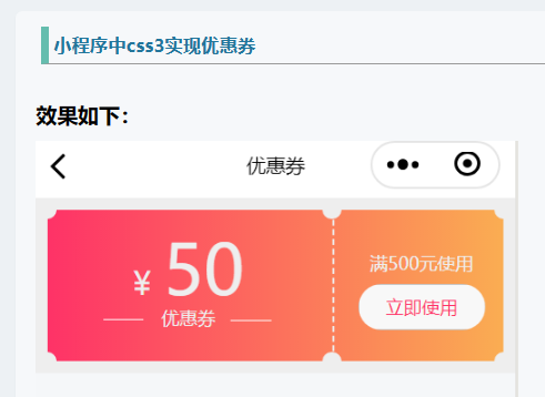
页面代码
<view class="wrapper">
    <view class="content">
        <view class="money">
            <text>¥</text>50
        </view>
        <view class='co'>
            <view class='co_w'></view>
            <view class="title">优惠券</view>
            <view class='co_l'></view>
        </view>
    </view>
    <view class="split-line"></view>
    <view class="tip">
        <view class="conditions">满500元使用</view>
        <button class="useNow" bindtap="">
        立即使用
        </button>
    </view>
</view>
样式代码
/*实现颜色渐变 */
.wrapper {
  margin: 0 auto;
  width: 100%;
  display: flex;
  background:linear-gradient(-90deg,rgba(250,173,82,1),rgba(254,50,103,1));
}

/*前半部分样式*/
.content {
  position: relative;
  flex: 1;
  padding: 20rpx 30rpx;
  text-align: center;
}

/*后半部分样式*/
.tip {
  position: relative;
  padding:  50rpx 30rpx;
  flex: 0 0 200rpx;
  text-align: center;
}

/*中间竖直虚线样式*/
.split-line {
    position: relative;
    flex: 0 0 0;
    margin: 0 10rpx 0 6rpx;
    border-left: 4rpx dashed #eee;
}

/*给虚线加两个伪类,基本样式如下*/
.split-line:before, .split-line:after {
    content: '';
    position: absolute;
    width: 32rpx;
    height: 16rpx;
    background: #eee;
    left: -18rpx;
    z-index: 1;
}

/*给前半部分加两个伪类,基本样式如下*/
.content:before, .content:after{
    content: '';
    position: absolute;
    width: 32rpx;
    height: 16rpx;
    background: #eee;
    left: -16rpx;
    z-index: 1;
}

/*给前半部分加两个伪类,基本样式如下*/
.tip:before, .tip:after{
    content: '';
    position: absolute;
    width: 32rpx;
    height: 16rpx;
    background:#eee;
    right: -16rpx;
    z-index: 1;
}

/*几个伪类化成的圆弧的样式以及位置(置于顶部)我把它放在一起了*/
.content:before, .tip:before, .split-line:before{
    border-radius: 0 0 16rpx 16rpx;
    top: 0;
}

/*几个伪类化成的圆弧的样式以及位置(置于底部)我把它放在一起了*/
.content:after, .tip:after, .split-line:after{
    border-radius: 16rpx 16rpx 0 0;
    bottom: 0;
}- 📖 参考文档
上下分布,分割线在中间
效果图
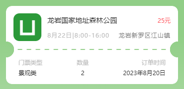
页面代码
<view class="ticket_card" v-for="(item,index) in ticketList" :key="index" @click="handleToDetail(item)">
    <view class="ticket_card_top">
        <view class="top_lt">
            <image src="../../static/logo.png"></image>
        </view>
        <view class="top_rt">
            <view class="title_box">
                <view class="title">{{item.title}}</view>
                <view class="price">{{item.price}}元</view>
            </view>
            <view class="date_box">
                <view class="dete">{{item.date}}</view>
                <view class="address">{{item.address}}</view>
            </view>
        </view>
    </view>
    <view class="ticket_card_bottom">
        <view class="ticket_card_bottom_item">
            <view class="key">门票类型</view>
            <view class="value">{{item.type}}</view>
        </view>
        <view class="ticket_card_bottom_item center">
            <view class="key">数量</view>
            <view class="value">{{item.nums}}</view>
        </view>
        <view class="ticket_card_bottom_item right">
            <view class="key">订单时间</view>
            <view class="value">{{item.createTime}}</view>
        </view>
    </view>
</view>
样式代码
.ticket_card {
    display: flex;
    padding: 15px;
    flex-direction: column;
    background: #fff;
    border-radius: 12px;
    margin-bottom: 15px;
    -webkit-mask-image: radial-gradient(circle at right 16px bottom 70px, transparent 16px, red 16.5px), linear-gradient(90deg, transparent 25%, red 0, red 75%, transparent 0);
    -webkit-mask-size: 100%, 18px 2px;
    -webkit-mask-repeat: repeat, repeat-x;
    -webkit-mask-position: 16px, 50% calc(100% - 69px);
    -webkit-mask-composite: source-out;
    mask-composite: subtract;
    .ticket_card_top {
        display: flex;
        .top_lt {
            width: 56px;
            height: 56px;
            margin-right: 12px;
            image {
                width: 100%;
                height: 100%;
                border-radius: 12px;
            }
        }
        .top_rt {
            flex: 1;
            display: flex;
            flex-direction: column;
            justify-content: space-around;
            .title_box {
                display: flex;
                align-items: center;
                justify-content: space-between;
                .title {
                    font-size: 14px;
                    color: #212121;
                }
                .price {
                    font-size: 12px;
                    color: #FF5158;
                }
            }
            .date_box {
                font-size: 12px;
                letter-spacing: 1px;
                color: #BCBCBC;
                display: flex;
                align-items: center;
                justify-content: space-between;
                margin-top: 5px;
                .address {
                    color: #797979;
                }
            }
        }
    }
    .ticket_card_bottom {
        display: flex;
        align-items: center;
        justify-content: space-between;
        margin-top: 35px;
        padding: 0 10px;
        .ticket_card_bottom_item {
            .key {
                font-size: 12px;
                color: #BCBCBC;
            }
            .value {
                font-size: 12px;
                color: #212121;
                margin-top: 5px;
            }
        }
        .center {
            text-align: center;
        }
        .right {
            text-align: right;
        }
    }

}
局部渐变
效果图
页面框架
<view>
    <!-- 上半部分背景渐变 -->
    <view class="header_bg">
        <!-- 用户信息部分 -->
        <view class="header">
            <view class="fl"></view>
            <view class="fr"></view>
        </view>
    </view>
    <!-- 功能区 -->
    <view class="order_nav"></view>
    <!-- 服务区 -->
    <view class="service_nav"></view>
    <!-- 退出登录按钮 -->
    <view v-if="userInfo.name" class="logout_btn" @click="handleLogOut">退出登录</view>
</view>
样式代码
/* 背景渐变 */
.header_bg {
    padding: 0 30rpx;
    height: 500rpx;
    background: linear-gradient(180deg, #6cbd5f 10%, #91ce87 50%, #fff 100%);
    position: relative;
    z-index: 2;
    overflow: hidden;
    .header {
        ...
    }
}
.header_bg::after {
    content: '';
    height: 100%;
    position: absolute;
    top: 0;
    z-index: 2;
    background: #2775b6;
}
/* 功能区和服务区 位置 */
.order_nav,.service_nav {
    width: 90%;
    height: auto;
    background: #FFFFFF;
    box-shadow: 0px 8rpx 16rpx 0px rgba(0, 0, 0, 0.08);
    border-radius: 12px;
    margin: -330rpx auto 0;
    position: relative;
    z-index: 3;
    ...
}
/* 退出按钮 */
.logout_btn {
    background: linear-gradient(45deg, #6cbd5f 10%, #91ce87 50%);
    margin: 20px;
    color: #fff;
    height: 45px;
    line-height: 45px;
    text-align: center;
    font-size: 14px;
    border-radius: 30px;
    box-shadow: 0px 8rpx 16rpx 0px rgba(0, 0, 0, 0.08);
}
文字居中
项目过程中遇到一个需求,长文本带图标,也就是在文字换行的情况下,结尾依然跟着图标,并且水平对齐。
如果用 flex 布局,会变成文字和图标是分开的。
目前已有的解决方法:
针对文本和图标,二者的 class 中,都加入 vertical-align: middle; 使其居中对齐。
弧形 + 背景图
需求:类似下图这样的,底部是弧形
我之前遇到过的是纯背景色的,直接用的伪类实现
这次看到了一个很新颖的解决方法,着实震惊哈哈哈哈
<view class="card_box">
	<image mode="widthFix" src=""></image>
</view>.card_box {
height: 410rpx;
width: 100%;
position: relative;
overflow: hidden;
border-radius: 0 0 50% 50% / 0 0 18% 18%;
image {
width: 100%;
height: 100%;
position: relative;
}
}丝带效果
效果图:
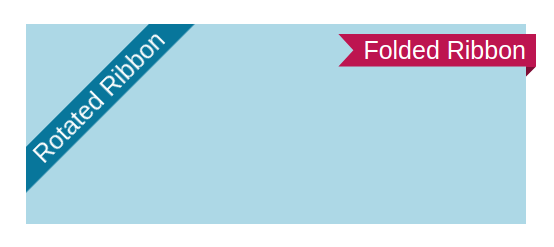
这次的需求,主要是因为需要把正式版和测试版小程序进行区分,就想到了 Flutter 运行的时候,右上角那种 debug 角标。搜索了一下,原来是叫 丝带 | 标签条
以下仅展示左侧的丝带效果:
<div class="ribbon-1 left">Rotated Ribbon</div>.ribbon-1 {
position: fixed;
background: #08769b;
box-shadow: 0 0 0 999px #08769b;
clip-path: inset(0 -100%);
}
.left {
inset: 0 auto auto 0;
transform-origin: 100% 0;
transform: translate(-29.3%) rotate(-45deg);
}- 📖 参考文档
- Folded and rotated ribbon codepen 源码
- 使用 CSS 制作丝带效果 freecodecamp 文章
- css简易制作一个div右上角的标签条 另一种写法