常用的过渡动画整理
鼠标移入移出,图片上下切换
效果图(示例)
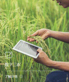
描述
- 鼠标移入:第一张图向下移出(隐藏),第二张图从上往下移入(显示),图上的内容整体从下往上拉伸(显示),这里加入遮罩,可以换成毛边玻璃效果
- 鼠标移出:第一张图向上移入(显示),第二张图从下往上移出(隐藏),图上的内容整体从上往下压缩(隐藏)
页面布局
html
<div class="li-box" @mouseenter="mouChange(index)" @mouseleave="mouChange1">
    <div class="imgbox" >
        <!-- 这里 class 里的判断,如果抛去第二个条件,所有的item都会一起动。所有加入下标防止所有都跟着动 -->
        <div :style="getBg(item.bg)" class="img1" :class="(mouseenter==true) && (index == currentIndex) ? 'toBottom':'bottomToTop'"></div>
        <div :style="getBg(item.activeBg)" class="img2" :class="(mouseenter==true) && (index == currentIndex) ? 'topToBottom':'toTop'"></div>
    </div>
    <div class="content">
        <img class="icon" :src="item.icon" />
        <h2>{{item.title}}</h2>
        <div class="desc" :class="(mouseenter==true) && (index == currentIndex) ? 'show_desc':'hide_desc'">{{item.desc}}</div>
        <div class="more">了解详情</div>
    </div>
</div>
CSS 基本布局样式
css
.li-box {
    /* 这里用的是背景图形式 */
    .imgbox {
        height: 422px;
        position: relative;
        overflow: hidden;
        /* 第一张图 往下移出 */
        .toBottom {
            animation: toBottom 0.5s;
            animation-fill-mode: forwards;
        }
        /* 第一张图 从下往上移入 显示 */
        .bottomToTop {
            animation: bottomToTop 0.5s;
            animation-fill-mode: forwards;
        }
        /* 第二张图 往上移出 */
        .toTop {
            animation: toTop 0.5s;
            animation-fill-mode: forwards;
        }
        /* 第二张图 从上往下移入 显示*/
        .topToBottom {
            animation: topToBottom 0.5s;
            animation-fill-mode: forwards;
        }
        /* 第一张图片 */
        .img1 {
            background-size: cover !important;
            top: 0px;
            position: absolute;
            left: 0px;
            width: 100%;
            height: 100%;
        }
        /* 第二张图片 */
        .img2 {
            background-size: cover !important;
            top: -422px;
            position: absolute;
            left: 0px;
            width: 100%;
            height: 100%;
        }
    }
    /* 图片上的内容 */
    .content {
        position: absolute;
        left: 0px;
        bottom: 0px;
        width: 100%;
        padding: 0px 29px;
        .icon {
            height: 40px;
        }
        h2 {
            font-size: 20px;
            font-family: PingFangSC-Medium,PingFang SC;
            font-weight: 500;
            color: #FFFFFF;
            line-height: 28px;
            border-bottom: 1px solid #fff;
            padding-top: 12px;
            padding-bottom: 19px;
        }
        .desc {
            font-size: 16px;
            font-family: PingFangSC-Medium,PingFang SC;
            font-weight: 500;
            color: #FFFFFF;
            line-height: 32px;
            height: 0px;
            text-shadow: 0px 13px 40px rgba(0,0,0,0.5);
            visibility: hidden;
        }
        .show_desc {
            animation: bottomToTop1 0.5s;
            animation-fill-mode: forwards;
        }
        .hide_desc {
            animation: topToBottom1 0.5s;
            animation-fill-mode: forwards;
        }
        .more {
            display: inline-block !important;
            margin-top: 16px;
            margin-bottom: 21px;
            font-size: 16px;
            font-family: PingFangSC-Medium,PingFang SC;
            font-weight: 500;
            color: #FFFFFF;
            line-height: 22px;
            vertical-align: middle;
            padding-right: 26px;
            background: url('https://www.teamsun.com.cn/resources/front/hstc/cn/images/white-ljxq@2x.png') no-repeat right center;
            background-size: 16px;
        }
    }
}
CSS 关键动画代码
css
/* 第一张图 往下移出 隐藏 */
@keyframes toBottom {
    0% {
        top: 0px;
    }
    100% {
        top: 422px;
    }
}
/* 第一张图 从底部往上移入 显示*/
@keyframes bottomToTop {
    0% {
        top: 422px;
    }
    100% {
        top: 0px;
    }
}

/* 第二张图 往上移出 隐藏 这里加了遮罩 可以换成毛边玻璃效果*/
@keyframes toTop {
    0% {
        top: 0px;
        filter: brightness(50%);
    }
    100% {
        top: -422px;
        filter: brightness(1);

    }
}

/* 第二张图 从上往下 移入 显示*/
@keyframes topToBottom {
    0% {
        top: -422px;
        filter: brightness(1);
        /* filter: blur(20px); 毛边玻璃效果 */
    }
    100% {
        top: 0px;
        /* filter: blur(3px); */
        filter: brightness(50%);
    }
}

/* 图片上的内容 */
/* 从下往上移入 显示 */
@keyframes bottomToTop1 {
    0% {
        visibility: hidden;
        height: 0px;
    }
    100% {
        visibility: visible;
        height: 214px;
        margin: 16px 0 6px;
    }
}
/* 从上往下移出 隐藏 */
@keyframes topToBottom1 {
    0% {
        visibility: visible;
        height: 214px;
    }
    50% {
        display: none;
        visibility: hidden;
    }
    100% {
        display: none;
        visibility: hidden;
    }
}
js代码(鼠标移入移出事件)
javascript
export default {
	data() {
		return {
			mouseenter: false,
			currentIndex: 0
        }
    },
    computed: {
        // 用计算属性,写背景图片样式
		getBg() {
			return function(imgUrl) {
				return `background: url('${imgUrl}') no-repeat center center`
			}
		}
	},
    methods: {
        // 鼠标移入 赋值index
	    mouChange(index) {
			this.currentIndex = index;
			this.mouseenter = true;
	    },
        // 鼠标移出
	    mouChange1() {
			this.mouseenter = false
	    }
	}
}
鼠标移入移出,文字放大缩小,侧边border动效
效果图(示例)
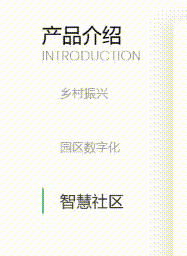
描述
- 鼠标移入:文字放大,侧边border从上往下显现
- 鼠标移出:文字缩小,侧边border从下往上隐藏
页面布局
html
<!-- tab栏 -->
<div class="tabs">
    <span
        v-for="(item,index) in tabList"
        :key="index"
        class="tab"
        :class="(index == currentIndex) ? 'tabActive line': (mouseenter == true && hoverIndex == index ? 'line tabHover': 'hideLine toSmall')"
        @mouseenter="Enter(index)" @mouseleave="Leave"
        @click="handleTab(index)"
    >
        <span >{{item.name}}</span>
    </span>
</div>
CSS 基本布局样式
css
.tabs {
    padding: 25px 0 1px;
    display: flex;
    flex-direction: column;
    .tab {
        display: block;
        position: relative;
        height: 38px;
        line-height: 38px;
        margin-bottom: 43px;
        font-size: 18px;
        font-family: PingFangSC-Medium,PingFang SC;
        font-weight: 500;
        color: rgba(51,51,51,.5);
        padding-left: 27px;
        cursor: pointer;
    }
    /* 如果是当前所点击的tab 样式 */
    .tabActive {
        font-size: 24px;
        font-family: PingFangSC-Medium,PingFang SC;
        font-weight: 500;
        color: #333333;
    }
    /* 鼠标移入,对应的tab样式及动画效果 放大文字 */
    .tabHover {
        font-size: 24px;
        font-family: PingFangSC-Medium,PingFang SC;
        font-weight: 500;
        color: #333333;
        cursor: pointer;
        animation: toBig 0.5s;
        animation-fill-mode: forwards;
    }
    /* 鼠标移入,对应的tab左侧划线及动画效果  */
    .line:after {
        content: "";
        position: absolute;
        left: 0px;
        top: 0px;
        height: 100%;
        background: #55bb8a;
        width: 3px;
        animation: toShowLine 0.5s;
        animation-fill-mode: forwards;
    }
    /* 鼠标移出,隐藏左侧划线 */
    .hideLine:after {
        content: "";
        position: absolute;
        left: 0px;
        top: 0px;
        height: 0px;
        background: #55bb8a;
        width: 3px;
        animation: toHideLine 0.5s;
        animation-fill-mode: forwards;
    }
    /* 鼠标移出,把字体变小 */
    .toSmall {
        animation: toSmall 0.5s;
        animation-fill-mode: forwards;
    }
}
CSS 关键动画代码
css
/* tab文字放大 */
@keyframes toBig {
    0%{
        font-size: 18px;  /*开始为原始大小  这里应该也可以使用 scale函数*/
    }
    100% {
        font-size: 24px;
    }
}
/* tab文字缩小 */
@keyframes toSmall {
    0%{
        font-size: 24px;
    }
    100% {
        font-size: 18px;  /*开始为原始大小*/
    }
}

/* 显示侧边线 */
@keyframes toShowLine {
    0%{
        height: 0px;
    }
    100% {
        height: 100%;
    }
}
/* 隐藏侧边线 */
@keyframes toHideLine {
    0%{
        height: 100%;
    }
    100% {
        height: 0px;
    }
}
js代码
javascript
export default {
	data() {
		return {
			mouseenter: false, //tab hover flag
			currentIndex: 0, // 当前tab下标(用来控制tab对应内容显示的下标)
			hoverIndex: null, // 当前鼠标移入的tab下标
        }
    },
    methods: {
		// 鼠标移入事件
	    Enter(index) {
			this.hoverIndex = index;
			this.mouseenter = true;
	    },
		// 鼠标移出事件
	    Leave() {
			this.mouseenter = false
	    },
		// tab点击事件
		handleTab(index) {
			this.currentIndex = index;
		}
	},
}
鼠标点击,切换局部内容效果(对应上边的tab右侧)
效果图(示例)
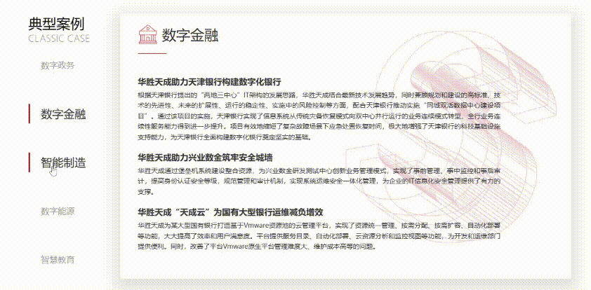
描述
- 鼠标点击: 对应的tab内容从右侧移入进行内容切换
页面布局
html
<div class="right-box wow animate__animated animate__fadeInUp" data-wow-delay="1s">
    <div
        class="model"
        :class="(index == currentIndex) ? 'active' : ''"
        v-for="(item,index) in tabList"
        :key="index"
        v-show="index == currentIndex"
    >
        <div class="title">
            <img v-if="index == 0" src="图标1"/>
            <img v-else-if="index == 1" src="图标2"/>
            <img v-else src="图标3"/>
            <span>{{item.content.name}}</span>
        </div>
        <div class="text">
            <div v-if="item.content.list">
                <h3>{{item.content.subtile}}</h3>
                <div class="desc-eg" style="">
                    <p v-for="(child,childIndex) in item.content.list" :key="childIndex">{{child.eg}}</p>
                </div>
            </div>
            <h3>{{item.content.title}}</h3>
            <div class="height20"></div>
            <div class="text-desc">{{item.content.desc}}</div>
        </div>
    </div>
</div>
CSS 基本布局样式
css
.right-box {
    width: calc(100% - 196px);
    height: 553px;
    box-shadow: 0px 12px 24px 10px rgba(0,0,0,0.1);
    .model {
        height: 100%;
        width: 100%;
        visibility: visible;
        opacity: 1;
        z-index: 5;
        left: 0px;
        transition: all 0.4s;
        padding-left: 38px;
        padding-top: 31px;
        padding-right: 38px;
        .title {
            position: relative;
            padding-bottom: 21px;
            line-height: 42px;
            font-size: 0px;
            img {
                height: 42px;
                vertical-align: middle;
                display: inline;
            }
            span {
                padding-left: 10px;
                font-size: 30px;
                font-family: PingFangSC-Medium,PingFang SC;
                font-weight: 500;
                display: inline-block;
                vertical-align: middle;
                color: #333333;
            }
        }
        .title::after {
            width: 61px;
            height: 1px;
            position: absolute;
            left: 0px;
            bottom: 0px;
            content: "";
            background: #55bb8a;
        }
        .text {
            width: 775px;
            max-width: 100%;
            height: calc(100% - 63px);
            display: flex;
            flex-direction: column;
            justify-content: center;
            padding-bottom: 30px;
            .desc-eg {
                padding: 5px 0 25px 0;
                p {
                    font-size: 16px;
                    font-family: PingFangSC-Medium,PingFang SC;
                    font-weight: 500;
                    color: #333333;
                    line-height: 30px;
                    padding-left: 20px;
                    position: relative;
                }
                p::after {
                    content: "";
                    position: absolute;
                    left: 0px;
                    width: 8px;
                    height: 8px;
                    background: #509c7c;
                    border-radius: 400px;
                    top: 10px;
                }
            }
            h3 {
                font-size: 18px;
                font-family: PingFangSC-Semibold,PingFang SC;
                font-weight: 600;
                color: #333333;
                line-height: 25px;
            }
            .height20 {
                height: 20px;
            }
            .text-desc {
                font-size: 14px;
                font-family: PingFangSC-Medium,PingFang SC;
                font-weight: 500;
                color: #333333;
                line-height: 20px;
                padding-top: 10px;
            }
        }
    }
    .active {
        animation: toLeft 1s;
        animation-fill-mode: forwards;
    }
}
CSS 关键动画代码
css
@keyframes toLeft {
    0%{
        visibility: hidden;
        margin-left: 60px;
        opacity: 0;
    }
    100% {
        visibility: visible;
        margin-left: 0px;
        opacity: 1;
    }
}
鼠标移入,图片放大缩小(transform 实现)
效果图(示例)

页面布局
html
<div class="imgbox">
    <img :src="item.imgUrl" />
</div>
CSS
css
.imgbox {
    overflow: hidden;
    img {
        width: 100%;
        border: 0px;
        vertical-align: middle;
        transition: all 0.5s;
    }
    img:hover {
        transform: scale(1.1);
        cursor: pointer;
    }
}
鼠标移入,整体上移(transform 实现)
效果图(示例)
页面布局
html
<div class="menu_item" v-for="(item,index) in menuList" :key="index">
    <div class="icon" :style="getBg(item.icon)"></div>
    <div class="title">{{item.name}}</div>
</div>
CSS
css
.menu_item {
display: block;
position: relative;
overflow: hidden;
box-shadow: 0px 0px 10px 0px rgba(0,0,0,0.18);
...
transition: all 0.4s;
}
.menu_item:hover {
box-shadow: 0px 0px 10px 0px rgba(0,0,0,0.4);
transform: translate(0%, -5px);
cursor: pointer;
transition: all 0.4s;
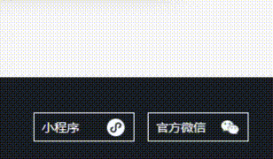
}鼠标移入,显示图片,边框样式,图标上下切换
效果图(示例)
页面布局
html
<div class="link">
    <!-- 小程序 -->
    <div class="link_item">
        <div class="title">小程序</div>
        <div class="slide">
            <img src="二维码"/>
        </div>
    </div>
    <!-- 官方微信 -->
    <div class="link_item">
        <div class="title">官方微信</div>
        <div class="slide">
            <img src="二维码"/>
        </div>
    </div>
</div>
CSS 基本布局样式
css
.link {
    padding-left: 4px;
    display: flex;
    .link_item {
        position: relative;
        margin-right: 15px;
        .title {
            display: block;
            overflow: hidden;
            width: 114px;
            line-height: 31px;
            border: 1px solid #fff;
            padding-left: 9px;
            font-size: 14px;
            font-family: PingFangSC-Regular,PingFang SC;
            font-weight: 400;
            color: #fff;
            position: relative;
        }
        .title:before {
            content: "";
            height: 100%;
            right: 10px;
            width: 20px;
            background: url('icon before') no-repeat center center;
            background-size: 100%;
            top: -33px;
            position: absolute;
            transition: all 0.4s;
            animation: toTop 0.5s;
            animation-fill-mode: forwards;
        }
        .title:after {
            content: "";
            height: 100%;
            right: 10px;
            width: 20px;
            background: url('icon after') no-repeat center center;
            background-size: 100%;
            top: 0px;
            position: absolute;
            transition: all 0.4s;
            animation: bottomToTop 0.5s;
            animation-fill-mode: forwards;
        }
        .slide {
            position: absolute;
            bottom: 24px;
            left: 50%;
            transform: translate(-50%,0%);
            width: 110px;
            text-align: center;
            opacity: 0;
            visibility: hidden;
            z-index: -1;
            transition: all 0.4s;
            img {
                width: 100%;
                border: 0px;
                vertical-align: middle;
            }
        }
    }
    .link_item:hover {
        cursor: pointer;
        .title {
            color: #A7BE8E;
            border: 1px solid #A7BE8E;
        }
        .title:before {
            animation: topToBottom 0.5s;
            animation-fill-mode: forwards;
        }
        .title:after {
            animation: toBottom 0.5s;
            animation-fill-mode: forwards;
        }
        .slide {
            visibility: visible;
            opacity: 1;
            bottom: 34px;
            z-index: 5;
        }
    }
    .link_item:nth-child(1) {
        .title:before {
            background: url('before icon') no-repeat center center;
            background-size: 100%;
        }
        .title:after {
            background: url('after icon') no-repeat center center;
            background-size: 100%;
        }
    }
}
CSS 关键动画代码
css
/* 原始图标 往下 */
@keyframes toBottom {
	0% {
		top: 0px;
	}
	100% {
		top: 33px;
	}
}
/* 原始图标 从底部往上 */
@keyframes bottomToTop {
	0% {
		top: 33px;
	}
	100% {
		top: 0px;
	}
}
/* active图标 在上面 */
@keyframes toTop {
	0% {
		top: 0px;
	}
	100% {
		top: -33px;
	}
}
/* active图标 下来 */
@keyframes topToBottom {
	0% {
		top: -33px;
	}
	100% {
		top: 0px;
	}
}
鼠标移入移出,底部border从中间往两边展开收缩
效果图(示例)
页面布局
html
<li
    @mouseenter="evtSideEnter"
    class="category-first-item"
    :class="index ==  currentIndex ? 'category-first-item-active':'category-first-item'"
    v-for="(item, index) in categoryList" :key="index"
    @click="handleCategory(item,index)"
>
    <span class="line">{{item.name}}</span>
</li>
CSS
css
.category-first-item-active,.category-first-item:hover {
    color: #3773DB;
    font-weight: 600;
    background-color: #fff;
    .line {
        position: relative;
        display: block;
        height: 100%;
    }

    .line::after {
        content: "";
        height: 2px;
        overflow: hidden;
        display: block;
        left:0;
        bottom:0;
        position: absolute;
        width: 100%;
        background: #3773d8;
        animation: toShowLine 0.5s ease;
    }
}

// 显示侧边线
@keyframes toShowLine {
	0%{
		transform: scaleX(0);
	}
	100% {
		transform: scaleX(1);
	}
}
指定物体无限旋转
图例:
infinite: 无限
prefers-reduced-motion: 用于检测用户的系统是否被开启了动画减弱功能
css
/* 旋转0-360° 变化 */
@keyframes logo-spin {
  from {
    transform: rotate(0deg);
  }

  to {
    transform: rotate(360deg);
  }
}

/* 无限旋转 */
@media (prefers-reduced-motion: no-preference) {
  .logo {
    animation: logo-spin infinite 20s linear;
  }
}